
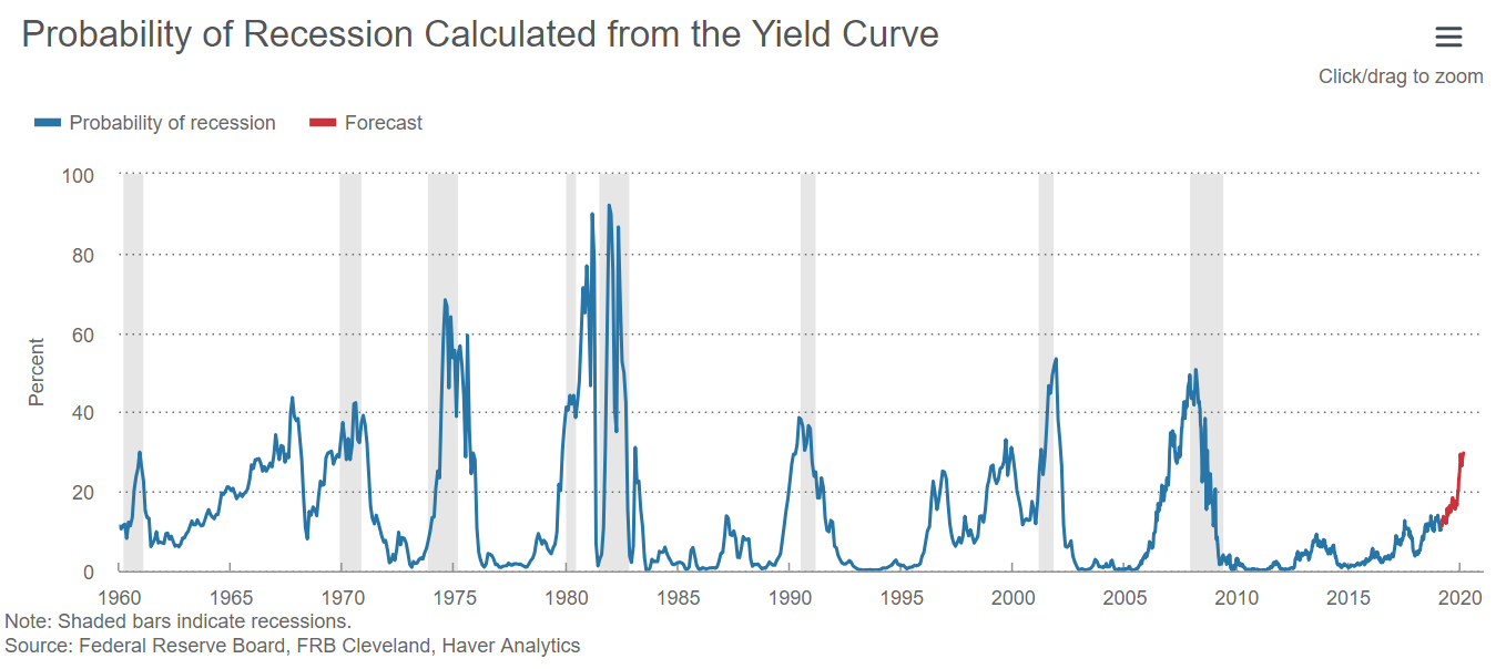
In addition to market valuation ratios like CAPE, the slope of the yield curve is one of the most talked about signals used to estimate future recessions and market returns.
During the second half of last month (March 2019), the yield curve has inverted by about 5 basis points with the 10-year rate reaching 2.37% and 3-month 2.42%.
Although, by the end of the month, the curve flipped slightly positive again, a graph like this makes this signal look like a “no-brainer” and during March it look bad!
Using data from Global Financial Data (GFD), I went back to 1920 and looked at what happens to the market returns after the yield curve goes negative. I measure the yield curve as the difference between the constant maturity 10-year US Government bond yield and the 90-day T-bill yield, and then break up the entire history into positive and negative months based on the sign of the curve. For each sign, I then measure the future average 12, 36, 60-month total return of the S&P500 Equity Index.

Indeed, historically, returns have been much lower following negative curve months, but no reason to ‘panic and sell everything’ based on this view.
Next, I wanted to see if there is a relationship between the length of time that the curve stays inverted and the future market returns. I measure the number of months in a row that the curve remains negative and then report the future market returns for each length.

We can see that the first month of inversion occurred 18 times since 1920, and on average was followed by 8% 12-month return, and 7% annualized 36-month return. While it’s worse than the overall history, it’s not a ‘panic’ signal yet. The 5-year forward return following the first month of inversion was 5% per year, about half of the long-run average market return.
Looking at all the individual first months of curve inversions, we see a large dispersion of future outcomes - something that averages often hide. Not only does the 12-month forward average return of 7.6% looks decent, but also, it has been much higher than that.

The picture gets more alarming when S&P500 returns are compared to US Government Bonds returns that follow yield inversions. From an asset allocation point of view, this becomes more nuanced. For example, following negative curve months, stocks on average don’t outperform bonds, and over 5-year future time frames under-perform by about 3.7% per year. So while on absolute basis, stocks on average still generate positive total returns, relative to bonds, they don’t.

Following the first month of curve inversion, stocks still beat bonds by 2% per year over the next 12 months. However, during longer windows like 36 and 60 months, stocks start to under-perform bonds.

While on the one hand, it appears that a successful tactical asset allocation strategy can be formed based on these numbers, in practice this is much harder to accomplish for two reasons.
First, when a signal does not work over a 12-month future horizon, but starts to work over longer time frames like 5-years, most tactical asset allocation portfolios, cannot efficiently capture this forecast because they re-balance much more frequently than the implied holding period of this forecast. This cancels out whatever longer-term effectiveness the signal had in the first place and only captures signal’s near-term forecasts, which are not effective.
Second, these are just average numbers. Even if the investor makes a 5-year asset allocation switch and does not change it, there have been many individual instances when stocks still outperformed bonds over 5-year time-frames after the first month inversion, like in the 1920, 1966, 1974, 1978, and 1989. Because the first month yield inversions are rare, occurring about 1.5% of the time, and because the dispersion of future market return outcomes is high, it is not easy to use it as a reliable signal. For example, an investor might follow the averages and allocate most of their capital to bonds in the current environment and commit to this allocation for the next 5 years. If that is the correct decision, they will appear very smart. But if it is not, the investor will need to wait for the next time the curve inverts, which might be years away, and then repeat this 5-year long allocation shift again and again, to start capturing the average affects. The element of time and high dispersion makes this a difficult strategy to execute.

Finally, the backtests above are done on a monthly frequency, and at the end of March the yield curve closed with a positive slope. So, technically speaking, there is nothing to worry about if you are strictly a rules-following quant. On the other hand, the historical averages do point to a higher probability of lower future stock minus bond return spread over medium-term horizons.